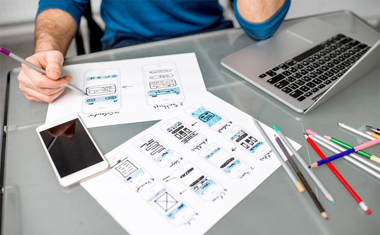
Everyone wants to build beautiful apps that look perfect and engages the audience instantly. But very few apps achieve perfect User Experience (UX) that resonates with their target audience. A gamut of apps falls short of the excellence they need to deliver just because of not following the critical UX principles or not evolving with the UX standards and design practices.
Here we are going to explain the key principles and practices to help mobile app developers to create standout UX.
Use Custom and Motion Graphics
Being visually attractive and engaging at a glance should be the primary design objective. To achieve this, there is no dearth of visual experiments and tweaks, but some visual elements remain the winner among the visual design experiments. The custom graphics and motion graphics in recent times have emerged as effective and highly efficient design elements for countless successful apps across the niches.
When you use custom graphics instead of stock photos, you give your app more visual relevance. Moreover, you can also incorporate a sense of humour or different visual twists with custom graphics. On the other hand, stock photos are like run of the mill visuals that lack depth and context most of the time.
In the same manner, motion graphics and animation can further add engaging visuals to your app and can ensure better visual engagement of the users. Animation and motion graphics can also deliver an informal look and feel. As the 5G technology is going to launch in 2020, more apps with these attractive visual experiments are about to come.
Give Utmost Importance to Button Design

Button design in the context of the mobile UX plays a very important role. In respect of achieving maximum traction with the CTA buttons, it is important to follow the developer guidelines of the respective platforms.
First of all, buttons should look like the buttons and follow the convention. This is why, from size to colour to contrast; every aspect of the button design really matters. The appropriate size of the button helps the users to tap on the buttons easily while the extra-large size can only make the visual clarity suffer. Opting for a balanced button size as per the guideline of Apple iOS and Android is important.
When it comes to shape, a button shape can differ from one platform to another. For example, Android buttons can be designed as flat and raised from the surrounding by following the material design principle; while for iOS flat button design is the convention.
Now, for choosing the colours for the buttons, you need to make sure that the buttons look actionable. Proper use of colour based upon the niche and appropriate contrast can play a vital role in engaging more audiences who will end up clicking the buttons.
Users like familiarity and they associate some colours with some niches and actions. This is why you need to choose button colours that intuitively tell them about the action to take and the course of steps to follow.
Minimalist Design
It is true that across the vast majority of the successful mobile apps, minimalist design right now dominates simply because of the ease of use this design principle offers to the users. The main factor behind the popularity of the minimalist design is the demand for visual clarity and dislike for clutter. No wonder, most apps either marginally or in a fully-fledged manner need to conform to this design principle.
A clutter-free simple design with a lot of white space helps reduce the visual distractions and while helping users to settle their attention on the app content and functions they need. Moreover, the minimalist design prioritizes the content and visual elements to give byte-sized content at a time and thus helps to avoid cognitive overload.
Stay Focused on User Objectives
The goal of a person using an app can be a lot different than the person accessing the same content or function through a desktop website. Since mobile app users mostly try to get away with the content and functions that can be accessed at a glance, the user interface and other design elements should help them stay focused on what they need at a particular context or situation.
For example, when the user needs to order something or get road directions, the app should exactly allow him to do the same without any delay.
Boost Personalization
Finally, for great user experience, any app needs to allow scope for personalization as much as possible. As today’s mobile apps, thanks to a host of innovative and cutting edge technologies, can personalize a lot of visual elements and UX attributes, personalization became a must-have UX design element that every app needs to incorporate.
Personalized UX design will help users get access to content when and where they need depending upon the context. Personalization also helps users get what they want without being exposed to distractions and cognitive overload.
For example, while using a banking app, if the user isn’t interested in all menu options, he should be allowed to customize the menu options and select favourite transactions to help them use the app most of the time.
Conclusion
In the years to come, mobile app user experience is likely to be more fluid, user-centric, and context-focused. The above principles only help you design mobile app UX with these attributes.

